
In today’s digital world, your website needs to shine on the small screen before anything else. Why? Because mobile traffic has officially taken over. If your website isn’t built with mobile users in mind first, you could be missing out on leads, sales, and long-term customer relationships.
Let’s break down what mobile-first design is, why it matters, and how it can benefit your business.
What Is Mobile-First Design?
Mobile-first design is exactly what it sounds like: designing for smartphones and tablets before scaling up to desktops. It flips the traditional design process on its head. Instead of starting with a full desktop layout and cramming it into smaller screens, mobile-first design ensures a smooth, streamlined experience for users who are on the go.
This approach forces designers and developers to prioritize essential content and functionality — making websites faster, cleaner, and easier to navigate.
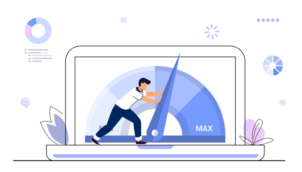
Why Mobile-First Matters More Than Ever
- Mobile Traffic Dominates
Over 60% of web traffic now comes from mobile devices. If your site isn’t optimized for mobile, you’re already behind. - Google Indexes Mobile-First
Google primarily uses the mobile version of your site for indexing and ranking. That means poor mobile UX can hurt your SEO. - Short Attention Spans
Mobile users want answers fast. If your page takes forever to load or is hard to navigate, they’ll bounce in seconds. - Trust and Professionalism
A clunky mobile site can make your brand look outdated or unreliable. First impressions are everything.
The Benefits of Mobile-First Design
✅ Faster Load Times
Designing for mobile forces leaner code and smaller image sizes — which helps your site load faster across all devices.
✅ Better User Experience
Navigation is intuitive, touch targets are big enough, and content is easy to consume — making it more likely users will stick around.
✅ Higher Conversions
When people can find what they need without pinching and zooming, they’re more likely to buy, book, or subscribe.
✅ Stronger SEO Performance
Google loves mobile-friendly sites. Mobile-first design helps you climb higher in search rankings.
How to Know If Your Site Is Mobile-First
- Pull up your site on your phone. Does it load quickly? Can you easily tap buttons and navigate?
- Use Google’s Mobile-Friendly Test to get a score and tips.
- If your mobile site feels like an afterthought, it probably is.
What to Do Next
If your website isn’t mobile-first, now’s the time to act. Whether you’re redesigning an existing site or building a new one, start small — literally. Think about what your mobile users need most, and strip away the fluff.
Work with a web team that understands responsive design, performance optimization, and user behavior on mobile. These elements aren’t nice-to-haves — they’re non-negotiables.
Final Thought
Mobile-first design isn’t a trend — it’s the new standard. It’s not just about adapting to mobile users; it’s about putting them first. And in a world where your website is often your first impression, that decision can make or break your business.
Need help building a mobile-first website that converts?
Let’s chat. We specialize in websites that work everywhere — but start with mobile in mind.